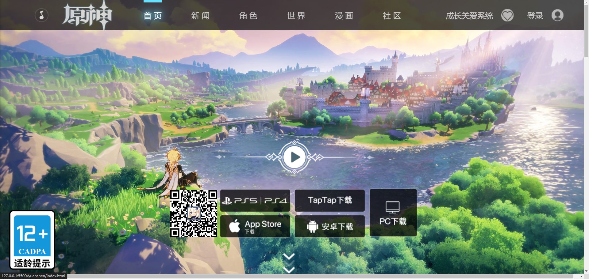
网页预览
HTML结构:
头部区域
HTML:
1
2
3
4
5
6
7
8
9
10
11
12
13
14
15
16
17
18
19
20
21
22
23
24
25
26
27
28
29
30
31
32
|
<div class="header">
<div class="header-left">
<div class="header-music"></div>
<a href="" class="header-logo">
<h1>原神</h1>
</a>
<div class="header-nav">
<a class="active" href="">首页</a>
<a href="">新闻</a>
<a href="">角色</a>
<a href="">世界</a>
<a href="">漫画</a>
<a href="">社区</a>
<div class="header-nav-bar"></div>
</div>
</div>
<div class="header-right">
<a href="" class="header-heart">
<span>成长关爱系统</span>
<img src="./asset/heart.png" alt="" />
</a>
<a href="">
<span>登录</span>
<img src="./asset/user.png" alt="" />
</a>
</div>
</div>
|
CSS:
1
2
3
4
5
6
7
8
9
10
11
12
13
14
15
16
17
18
19
20
21
22
23
24
25
26
27
28
29
30
31
32
33
34
35
36
37
38
39
40
41
42
43
44
45
46
47
48
49
50
51
52
53
54
55
56
57
58
59
60
61
62
63
64
65
66
67
68
69
70
71
72
73
74
75
76
77
78
79
80
81
82
83
84
85
86
87
88
89
90
91
92
93
94
95
| .header{
padding-left: 75px;
padding-right: 55px;
height: 66px;
background-color: rgba(17, 17, 17, 0.75);
color: #ccc;
font-size: 17px;
position: fixed;
width: 100%;
min-width: 1280px;
left: 0;
top:0;
z-index: 99;
display: flex;
justify-content: space-between;
}
.header-left{
display: flex;
align-items: center;
}
.header-music{
background: url(../asset/music.png);
background-size: 100% 100%;
width: 30px;
height: 30px;
cursor: pointer;
}
.header-music.closed{
background: url(../asset/music-close.png);
}
.header-logo{
background: url(../asset/logo.png) center top;
width: 127px;
height: 66px;
margin: 0 25px;
}
.header-logo h1{
display: none;
}
.header-nav{
display: flex;
height: 100%;
align-items: center;
position: relative;
}
.header-nav a{
padding: 0 30px;
letter-spacing: 5px;
}
.header-nav a:hover,
.header-nav a.active{
color: #fff;
text-shadow: 0px 0px 10px #69e0ff,0px 0px 20px #69e0ff,0px 0px 40px #69e0ff;
}
.header-nav-bar{
position: absolute;
width: 40px;
height: 5px;
background: #69e0ff;
left: 30px;
top: 0;
transition:0.2s;
}
.header-right{
display: flex;
align-items: center;
}
.header-right a{
margin-left: 30px;
display: flex;
align-items: center;
}
.header-right a img{
height: 27px;
width: 27px;
margin-left: 18px;
opacity: 0.6;
}
.header-right a:hover{
color: #fff;
}
.header-right a:hover img{
opacity: 1;
}
|
用到的知识点:
position
定位元素position有五个可选的属性:static relative absolute fix sticky
static
该关键字指定元素使用正常的布局行为,即元素在文档常规流中当前的布局位置。此时 top, right, bottom, left 和 z-index 属性无效。
relative
该关键字下,元素先放置在未添加定位时的位置,再在不改变页面布局的前提下调整元素位置
absolute
元素会被移出正常文档流,并不为元素预留空间,通过指定元素相对于最近的非 static 定位祖先元素的偏移,来确定元素位置。
fix
元素会被移出正常文档流,并不为元素预留空间,而是通过指定元素相对于屏幕视口(viewport)的位置来指定元素位置。元素的位置在屏幕滚动时不会改变。
sticky
元素根据正常文档流进行定位,然后相对它的最近滚动祖先和最近块级祖先,包括 table-related 元素,基于 top、right、bottom 和 left 的值进行偏移
min-width
min-width 属性为给定元素设置最小宽度。它可以阻止 width 属性的应用值小于 min-width 的值
z-index
z-index属性设置定位元素及其后代元素或 flex 项目的 Z 轴顺序。z-index 较大的重叠元素会覆盖较小的元素。
z-index`` 属性可以被设置为关键字 ``auto`` 或 ``<integer>
cursor:
1
2
3
4
5
6
7
8
9
10
11
12
13
14
|
cursor: pointer;
cursor: auto;
cursor: url(hand.cur), pointer;
cursor:
url(cursor1.png) 4 12,
auto;
cursor:
url(cursor2.png) 2 2,
pointer;
|
display: flex:
弹性盒模型
object-fit:
object-fit CSS 属性指定可替换元素的内容应该如何适应到其使用高度和宽度确定的框
1
2
3
4
5
| object-fit: contain;
object-fit: cover;
object-fit: fill;
object-fit: none;
object-fit: scale-down;
|
background:
复合属性,表示背景
margin: 0 auto:
居中
letter-spacing:
字间距大小
text-shadow:
文本阴影效果
transition:
过渡
opacity:
透明度
海报区域
HTML:
1
2
3
4
5
6
7
8
9
10
11
12
13
14
15
16
17
18
19
20
21
22
23
24
25
26
27
28
29
30
31
32
33
34
35
36
37
38
39
40
41
42
43
44
45
46
47
48
49
50
51
|
<div class="poster">
<video
class="poster-video"
src="./asset/video.mp4"
loop
autoplay
muted
></video>
<img class="poster-badge" src="./asset/badge.png" />
<div class="poster-arrows">
<div></div>
<div></div>
<div></div>
</div>
<div class="poster-d">
<div class="poster-qrcode">
<img src="./asset/d-qrcode.png" alt="" />
<img src="./asset/d-qrcode.jpeg" alt="" />
</div>
<div class="poster-part">
<a href="">
<img src="./asset/d-ps.png" alt="" />
<img src="./asset/d-ps-modal.png" alt="" />
</a>
<a href="">
<img src="./asset/d-ios.png" alt="" />
<img src="./asset/d-ios-modal.png" alt="" />
</a>
</div>
<div class="poster-part">
<a href="">
<img src="./asset/d-tap.png" alt="" />
<img src="./asset/d-tap-modal.png" alt="" />
</a>
<a href="">
<img src="./asset/d-android.png" alt="" />
<img src="./asset/d-android-modal.png" alt="" />
</a>
</div>
<a href="" class="poster-pc">
<img src="./asset/d-pc.png" alt="" />
<img src="./asset/d-pc-modal.png" alt="" />
</a>
</div>
<div class="poster-play">
<div class="poster-play-button"></div>
</div>
</div>
|
CSS:
1
2
3
4
5
6
7
8
9
10
11
12
13
14
15
16
17
18
19
20
21
22
23
24
25
26
27
28
29
30
31
32
33
34
35
36
37
38
39
40
41
42
43
44
45
46
47
48
49
50
51
52
53
54
55
56
57
58
59
60
61
62
63
64
65
66
67
68
69
70
71
72
73
74
75
76
77
78
79
80
81
82
83
84
85
86
87
88
89
90
91
92
93
94
95
96
97
98
99
100
101
102
103
104
105
106
107
108
109
110
111
112
113
114
115
116
117
118
119
120
121
122
123
124
125
126
127
128
129
130
131
132
133
134
135
136
| .poster{
position: relative;
}
.poster-video{
width: 100%;
height: 100vh;
display: block;
object-fit: cover;
}
.poster-badge{
position: absolute;
width:100px;
left: 20px;
bottom: 20px;
}
.poster-arrows{
position: absolute;
bottom: 12px;
left: 50%;
transform: translateX(-50%);
margin-left: -12.5px;
}
.poster-arrows div{
background: url(../asset/arrow.png);
width: 25px;
height: 15px;
animation: fade 1.5s infinite;
}
@keyframes fade{
50%{
opacity: 0;
}
}
.poster-arrows div:nth-child(2){
animation-delay: 0.5s;
}
.poster-arrows div:last-child(){
animation-delay: 1s;
}
.poster-d{
position: absolute;
width: 540px;
height: 125px;
left: 50%;
transform: translate(-50%);
bottom: 80px;
display: flex;
justify-content: space-between;
align-items: center;
}
.poster-qrcode{
position: relative;
}
.poster-qrcode img:first-child{
width: 102px;
height: 102px;
display: block;
}
.poster-qrcode img:last-child{
position: absolute;
left: 50%;
top:50%;
transform: translate(-50%,-50%);
width: 30px;
height: 30px;
border: 2px solid #475e7d;
border-radius: 4px;
}
.poster-part img{
width: 160px;
display: block;
}
.poster-part img:last-child {
display: none;
}
.poster-part a:hover img:first-child {
display: none;
}
.poster-part a:hover img:last-child {
display: block;
}
.poster-pc img:last-child {
display: none;
}
.poster-pc:hover img:first-child {
display: none;
}
.poster-pc:hover img:last-child {
display: block;
}
.poster-play{
width: 356px;
height: 76px;
position: absolute;
bottom: 220px;
left: 50%;
top: 50%;
transform: translateX(-50%);
background: url(../asset/play-bg.png);
cursor: pointer;
}
.poster-play-button {
width: 48px;
height: 48px;
background: #fff;
border-radius: 50%;
position: absolute;
left: 50%;
top: 50%;
transform: translate(-50%, -50%);
cursor: pointer;
}
.poster-play-button::after {
content: "";
background: url(../asset/play-inner.png);
width: 28px;
height: 28px;
position: absolute;
left: 50%;
top: 50%;
transform: translate(-50%, -50%);
cursor: pointer;
}
.poster-play-button {
transition: 0.2s;
}
.poster-play-button:hover {
background: transparent;
}
.poster-play-button::after:hover {
background-position: 0 -28px;
}
|
用到的知识点:
animation:
动画,复合属性
1
2
3
4
5
6
7
8
9
10
11
12
13
| animation: fade 1.5s infinite;
@keyframes fade{
50%{
opacity: 0;
}
}
|
transform 属性允许你旋转,缩放,倾斜或平移给定元素
1
2
| transform: translateX(-50%);
transform: scale(1.05);
|
border-radius
圆角
.poster-play-button::after:hover:
伪元素的悬浮状态
1
2
| .poster-play-button::after {
content: "";
|
1
2
3
| .poster-play-button::after:hover {
background-position: 0 -28px;
}
|
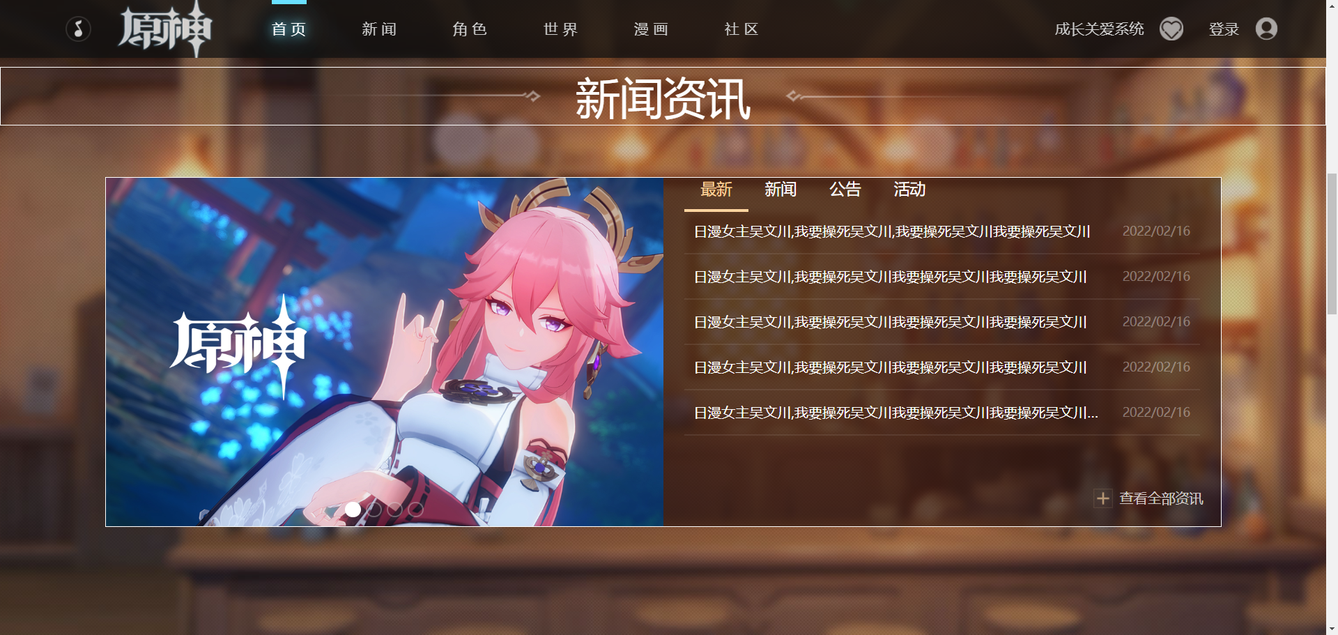
新闻区域
HTML:
1
2
3
4
5
6
7
8
9
10
11
12
13
14
15
16
17
18
19
20
21
22
23
24
25
26
27
28
29
30
31
32
33
34
35
36
37
38
39
40
41
42
43
44
45
46
47
48
49
50
51
52
53
54
55
56
57
58
59
60
61
62
63
64
65
66
67
68
69
70
71
| <div class="news">
<h2 class="news-title">
<span>新闻资讯</span>
</h2>
<div class="news-main">
<div class="news-banner">
<div class="news-banner-img">
<a href="">
<img src="./asset/banner1.jpg" alt="" />
</a>
<a href="">
<img src="./asset/banner2.jpg" alt="" />
</a>
<a href="">
<img src="./asset/banner3.jpg" alt="" />
</a>
<a href="">
<img src="./asset/banner4.jpg" alt="" />
</a>
</div>
<div class="news-banner-indicator">
<div class="active"></div>
<div></div>
<div></div>
<div></div>
</div>
</div>
<div class="news-container">
<div class="news-tab">
<span class="active">最新</span>
<span>新闻</span>
<span>公告</span>
<span>活动</span>
</div>
<div class="news-list">
<a href="">
<h2>
日漫女主吴文川,我要操死吴文川,我要操死吴文川我要操死吴文川
</h2>
<span>2022/02/16</span>
</a>
<a href="">
<h2>日漫女主吴文川,我要操死吴文川我要操死吴文川我要操死吴文川</h2>
<span>2022/02/16</span>
</a>
<a href="">
<h2>日漫女主吴文川,我要操死吴文川我要操死吴文川我要操死吴文川</h2>
<span>2022/02/16</span>
</a>
<a href="">
<h2>日漫女主吴文川,我要操死吴文川我要操死吴文川我要操死吴文川</h2>
<span>2022/02/16</span>
</a>
<a href="">
<h2>
日漫女主吴文川,我要操死吴文川我要操死吴文川我要操死吴文川我要操死吴文川
</h2>
<span>2022/02/16</span>
</a>
</div>
<a href="" class="news-more">查看全部资讯</a>
</div>
</div>
</div>
|
CSS:
1
2
3
4
5
6
7
8
9
10
11
12
13
14
15
16
17
18
19
20
21
22
23
24
25
26
27
28
29
30
31
32
33
34
35
36
37
38
39
40
41
42
43
44
45
46
47
48
49
50
51
52
53
54
55
56
57
58
59
60
61
62
63
64
65
66
67
68
69
70
71
72
73
74
75
76
77
78
79
80
81
82
83
84
85
86
87
88
89
90
91
92
93
94
95
96
97
98
99
100
101
102
103
104
105
106
107
108
109
110
111
112
113
114
115
116
117
118
119
120
121
122
123
124
125
126
127
128
129
130
131
132
133
134
135
136
137
138
139
140
141
142
| .news{
height: 910px;
background:url(../asset/news-bg.jpg) center;
color: #fff;
overflow: hidden;
}
.news-title{
border: 1px solid #fff;
font-size: 50px;
font-weight: normal;
text-align: center;
margin-top: 183px;
margin-bottom: 60px;
display: flex;
align-items: center;
justify-content: center;
}
.news-title::before,.news-title::after{
content: "";
width: 322px;
height: 14px;
background-image: url(../asset/title-bar-left.png);
}
.news-title::after{
transform: rotate(180deg);
}
.news-title span {
margin: 0 40px;
}
.news-main{
width: 1280px;
height: 400px;
outline: #fff solid 1px;
margin: 0 auto;
display: flex;
}
.news-banner{
width: 50%;
height: 100%;
position: relative;
overflow: hidden;
}
.news-banner-img {
width: 100%;
height: 100%;
display: flex;
transition: 0.2s;
}
.news-banner-img a {
width: 100%;
height: 100%;
flex-shrink: 0;
}
.news-banner-img img {
width: 100%;
height: 100%;
}
.news-banner-indicator{
display: flex;
width: 100%;
position: absolute;
bottom: 10px;
justify-content: center;
}
.news-banner-indicator div{
height: 18px;
width: 18px;
background: rgba(0, 0, 0, 0.1);
border: 2px solid rgba(255, 255, 255, 0.3);
margin: 0 3px;
border-radius: 50%;
}
.news-banner-indicator div.active {
border-color: #fff;
background: #fff;
}
.news-container{
width: 50%;
height: 100%;
background: rgba(38, 18, 12, 0.62);
padding: 0 24px;
position: relative;
}
.news-tab{
display: flex;
font-size: 18px;
border-bottom: 3px rgba(255, 255, 255, 0.1);
}
.news-tab span{
padding: 0 19px;
padding-bottom: 12px;
position: relative;
cursor: pointer;
}
.news-tab span.active{
color: #ffd49f;
}
.news-tab span.active::after {
content: "";
height: 3px;
background: #ffd49f;
width: 100%;
position: absolute;
left: 0;
bottom: -3px;
}
.news-list a {
display: flex block;
height: 52px;
align-items: center;
justify-content: space-between;
padding: 0 11px;
border-bottom: 2px solid rgba(255, 255, 255, 0.08);
}
.news-list a h2{
font-size: 16px;
width: 480px;
white-space: nowrap;
overflow: hidden;
text-overflow: ellipsis;
font-weight: normal;
}
.news-list a span {
font-size: 14px;
color: rgba(255, 255, 255, 0.35);
}
.news-list a:hover {
background: rgba(255, 212, 159, 0.06);
}
.news-more {
position: absolute;
right: 20px;
bottom: 20px;
height: 23px;
color: rgba(255, 255, 255, 0.75);
background: url(../asset/plus.png) no-repeat;
text-indent: 30px;
}
.news-more:hover {
color: rgba(255, 212, 159, 0.75);
}
|
用到的知识点:
line-height:
用于设置多行元素的空间量,如多行文本的间距。对于块级元素,它指定元素行盒(line boxes)的最小高度。对于非替代的 inline 元素,它用于计算行盒(line box)的高度
flex-shrink:
指定了 flex 元素的收缩规则。flex 元素仅在默认宽度之和大于容器的时候才会发生收缩,其收缩的大小是依据 flex-shrink 的值
white-space:
white-space 属性用于设置如何处理元素内的空白字符
overflow: hidden:
用于设置如何处理元素溢出
text-overflow:
文本溢出的处理
text-indent:
text-indent 属性能定义一个块元素首行文本内容之前的缩进量。
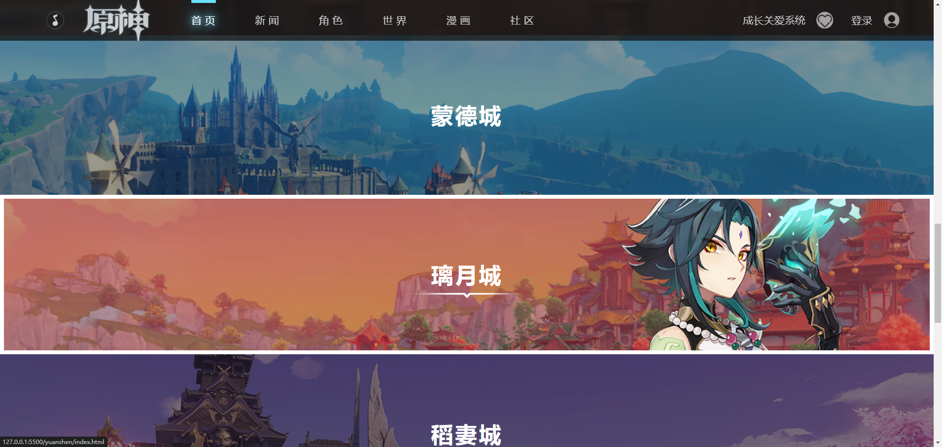
城市区域
HTML:
1
2
3
4
5
6
7
8
9
10
11
12
13
14
15
16
17
18
19
20
21
22
|
<div class="city">
<a href="" class="city-item">
<img src="./asset/city1.jpg" alt="" class="city-img" />
<img src="./asset/h1.png" alt="" class="city-hero" />
<h2>蒙德城</h2>
</a>
<a href="" class="city-item">
<img src="./asset/city2.jpg" alt="" class="city-img" />
<img src="./asset/h2.png" alt="" class="city-hero" />
<h2>璃月城</h2>
</a>
<a href="" class="city-item">
<img src="./asset/city3.jpg" alt="" class="city-img" />
<img src="./asset/h3.png" alt="" class="city-hero" />
<h2>稻妻城</h2>
</a>
<div href="" class="city-wait">
<img src="./asset/wait.jpg" alt="" class="city-img" />
<h2>敬请期待</h2>
</div>
</div>
|
CSS:
1
2
3
4
5
6
7
8
9
10
11
12
13
14
15
16
17
18
19
20
21
22
23
24
25
26
27
28
29
30
31
32
33
34
35
36
37
38
39
40
41
42
43
44
45
46
47
48
49
50
51
52
53
54
55
56
57
58
59
60
61
62
63
64
65
66
67
68
69
70
71
72
73
74
75
76
77
78
79
80
81
82
83
84
85
86
87
88
89
90
91
92
93
94
| .city-item{
overflow: hidden;
display: block;
height: 260px;
position: relative;
}
.city-img{
height: 260px;
display: block;
width: 100%;
object-fit: cover;
transition: 0.4s;
}
.city-item::after,
.city-wait::after{
content: '';
position: absolute;
width: 100%;
height: 100%;
background: rgba(0, 0, 0, 0.4);
transition: 0.4s;
left: 0;
top: 0;
z-index: 2;
}
.city-item h2,.city-wait h2{
color: #fff;
font-size: 36px;
letter-spacing: 3px;
position: absolute;
left: 0;
top: 0;
width: 100%;
height: 100%;
text-align: center;
line-height: 260px;
background-image: url(../asset/title-square.png) no-repeat;
z-index: 4;
}
.city-hero{
position: absolute;
bottom: 0;
right: -100px;
z-index: 3;
opacity: 0;
transition: 0.4s;
}
.city-item h2::after{
content: '';
position: absolute;
height: 10px;
width: 210px;
background: url(../asset/title-decoration.png);
left: 50%;
transform: translateX(-50%);
top: 160px;
opacity: 0;
transition: 0.4s;
}
.city-item::before{
content: '';
position: absolute;
width: 100%;
height: 100%;
border: 7px solid transparent;
z-index: 5;
}
.city-item:hover .city-hero{
opacity: 1;
}
.city-item:hover h2::after{
opacity: 1;
}
.city-item:hover::before{
border-color: #fff;
}
.city-item:hover::after{
background-color: rgba(0, 0, 0, 0.2);
}
.city-item:hover .city-img{
transform: scale(1.05);
}
.city-wait{
position: relative;
}
.city-wait h2{
background: none;
color: rgba(0,0,0,0.4);
}
|
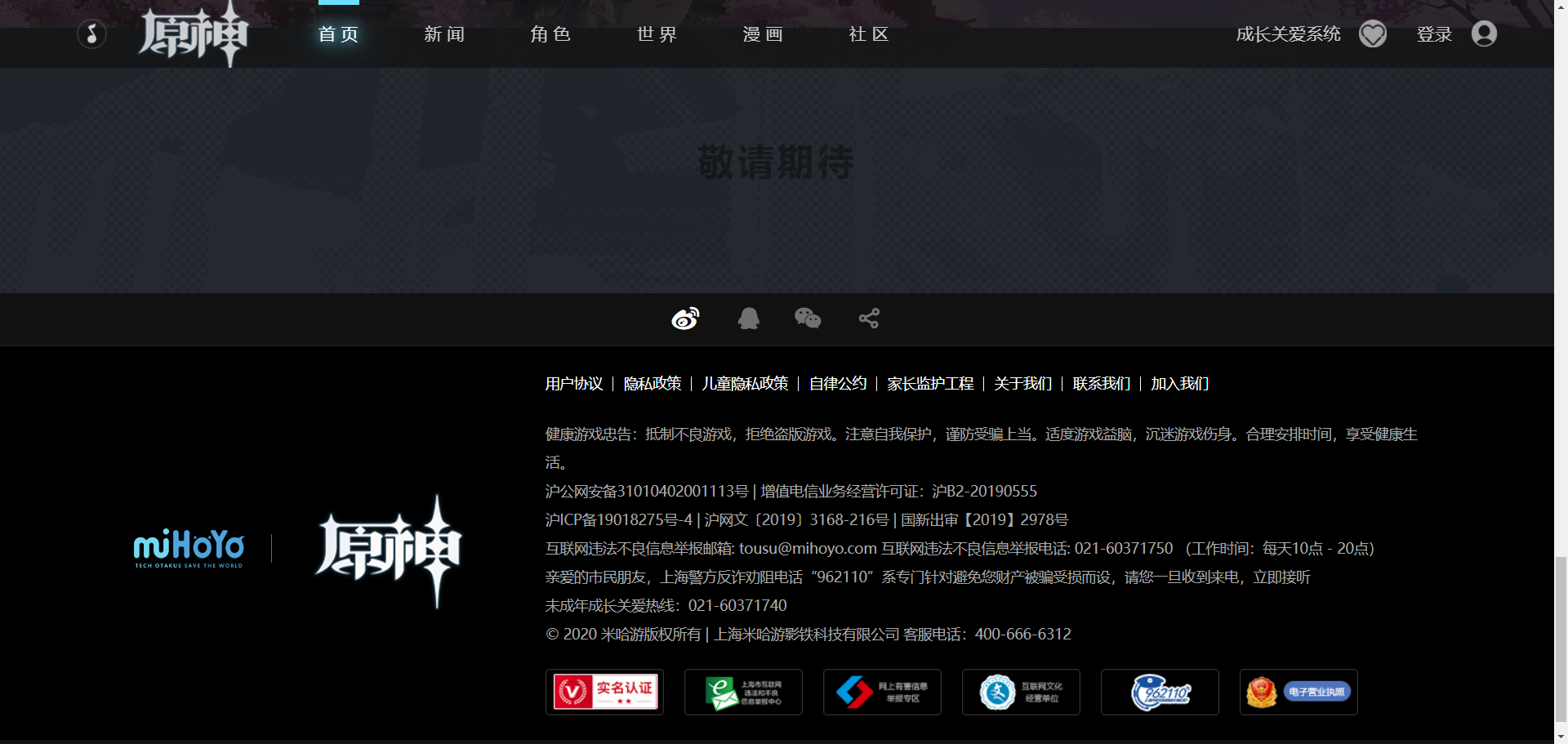
页脚区域
HTML:
1
2
3
4
5
6
7
8
9
10
11
12
13
14
15
16
17
18
19
20
21
22
23
24
25
26
27
28
29
30
31
32
33
34
35
36
37
38
39
40
41
42
43
44
45
46
47
48
49
50
51
52
53
54
55
56
57
58
59
60
61
62
63
64
65
66
67
68
69
70
71
72
73
| <div class="footer">
<div class="footer-contact">
<a href=""><i class="iconfont icon-xinlangweibo"></i></a>
<a href=""><i class="iconfont icon-QQ"></i></a>
<a href=""><i class="iconfont icon-weixin"></i></a>
<a href=""><i class="iconfont icon-fenxiang"></i></a>
</div>
<div class="footer-main">
<div class="footer-container">
<img src="./asset/corp-logo.png" class="footer-corp-logo" />
<div class="footer-split"></div>
<img src="./asset/game-logo.png" class="footer-game-logo" />
<div class="footer-content">
<div class="footer-links">
<a href="">用户协议</a>
<a href="">隐私政策</a>
<a href="">儿童隐私政策</a>
<a href="">自律公约</a>
<a href="">家长监护工程</a>
<a href="">关于我们</a>
<a href="">联系我们</a>
<a href="">加入我们</a>
</div>
<div class="footer-info">
<p>
健康游戏忠告:抵制不良游戏,拒绝盗版游戏。注意自我保护,谨防受骗上当。适度游戏益脑,沉迷游戏伤身。合理安排时间,享受健康生活。
</p>
<p>
<a href="">沪公网安备31010402001113号</a>
| 增值电信业务经营许可证:沪B2-20190555
</p>
<p>
<a href="">沪ICP备19018275号-4</a>
| 沪网文〔2019〕3168-216号 | 国新出审【2019】2978号
</p>
<p>
互联网违法不良信息举报邮箱: tousu@mihoyo.com
互联网违法不良信息举报电话: 021-60371750 (工作时间:每天10点 -
20点)
</p>
<p>
亲爱的市民朋友,上海警方反诈劝阻电话“962110”系专门针对避免您财产被骗受损而设,请您一旦收到来电,立即接听
</p>
<p>未成年成长关爱热线:021-60371740</p>
<p>
© 2020 米哈游版权所有 | 上海米哈游影铁科技有限公司
客服电话:400-666-6312
</p>
</div>
<div class="footer-icon">
<a href="">
<img src="./asset/footer-icon1.png" alt="" />
</a>
<a href="">
<img src="./asset/footer-icon2.png" alt="" />
</a>
<a href="">
<img src="./asset/footer-icon3.png" alt="" />
</a>
<a href="">
<img src="./asset/footer-icon4.png" alt="" />
</a>
<a href="">
<img src="./asset/footer-icon5.png" alt="" />
</a>
<a href="">
<img src="./asset/footer-icon6.png" alt="" />
</a>
</div>
</div>
</div>
</div>
</div>
|
CSS:
1
2
3
4
5
6
7
8
9
10
11
12
13
14
15
16
17
18
19
20
21
22
23
24
25
26
27
28
29
30
31
32
33
34
35
36
37
38
39
40
41
42
43
44
45
46
47
48
49
50
51
52
53
54
55
56
57
58
59
60
61
62
63
64
65
66
67
68
69
70
71
| .footer{
background: #111;
font-size: 14px;
color: #aaa;
padding-bottom: 40px;
}
.footer a:hover{
color: #fff;
}
.footer-contact{
display: flex;
justify-content: center;
align-items: center;
height: 52px;
color: #707070;
border-bottom:2px solid #1a1a1a
}
.footer-contact .iconfont{
font-size: 30px;
margin: 0 15px;
}
.footer-main{
background: #000;
padding-top: 30px;
padding-bottom: 20px;
}
.footer-container{
width: 1280px;
margin: 0 auto;
display: flex;
align-items: center;
}
.footer-corp-logo{
padding-left: 10px;
width: 119px;
}
.footer-split{
width: 1px;
height: 28px;
background: #666;
margin: 0 25px;
}
.footer-content{
margin-left: 60px;
}
.footer-links{
display: flex;
color: #fff;
margin-bottom: 28px;
}
.footer-links a{
padding: 0 10px;
border-right: 1px solid #fff;
line-height: 1;
}
.footer-links a:last-child{
border: none;
}
.footer-links a:first-child{
padding-left: 0;
}
.footer-info{
line-height: 2;
}
.footer-icon{
display: flex;
margin-top: 20px;
}
.footer-icon a{
margin-right: 20px;
}
|